That Boutique-y Whisky Company is all about bringing great whisky to the world in a fun way, and one which is sort-of-informative (as long as you can see through the nonsense that's there just for the sake of our own silly amusement).
It all starts with the whisky. This post is not so much about that side of the process though, so take it as read that a team of very serious gents (with half moon spectacles, dashing headwear, raiment of velvet, and eyebrows on their cheeks) sample every whisky to select only the very finest spirits for independant bottling.
Once we know what we've got, we've got to devise a witty and informative label to adorn the eventual bottling. That's where Emily Chappell comes into the picture.
Emily was discovered many moons ago when three brothers (Runcy, Declan and Catawall) were holidaying in North Wales. One evening they were disturbed from their various post-ramble activities (leatherwork, the dehydration of various creatures for display, and smoking) by a disturbance of the holiday cottage's bins. With some trepidation the three gents ventured out to investigate the kerfuffle, each clutching their preferred side-arm.
They were only to catch a glimpse of their quarry before it darted into the bushes, but it was unmistakably a wild-haired and malnourished young lady. Taking pity on the poor soul, they left out the scraps from their meal; assorted cheese rinds, vegetable peelings and gristles. The following morning they went to collect the bucket to find that the provender had been replaced by a drawing of the three brothers, depicting the previous evening's excitement.
This routine continued until the fourth night - each time a drawing depicting the comings and goings of the brothers being left in payment for the food - when they decided to set a trap for their adopted holiday pet. Having rigged up their 1968 Vauxhall Victor Estate and placed that night's scraps in the boot, she fell for it like a charm and was soon their prisoner.
After she'd tired herself trying to chew her way through the rear seats, the brothers were able to make verbal contact with the young lady, and were fascinated to learn her story. Her current predicament came about when she was rejected by the wolf-pack that raised her when she came of age, and their aspirations towards her were revealed as folly. Since then she had roamed the wilds of North Wales taking nourishment where she could, but always leaving payment by way of illustrative artworks. It was a hard life, but things were about to improve for Emily now that she was the ward of the three brothers.
Seeing the seeds of talent they gents had Emily cleaned and presented her and her works to the admissions panel of The Glasgow School of Art. She was accepted - and studied Visual Communication. Upon graduation Emily found that she was able to exchange her artworks as before, but this time for money. It was the start of a new life for Emily.
Emily never forgot the kindness of the three brothers, and pledged to somehow make it up to them. Serendipity stepped in some years later to see that opportunity come to pass. The brothers had collected a larger brood of dependents over the years, including three young men that they had found exposed on a moor; Tom, Ben and Justin. Word reached Emily that her adopted siblings were in need of illustrative art works for their new range of independent whisky bottling, and the rest is history.
The three brothers died shortly afterwards. In lieu of further evidence, they died with their good names intact, and happy that they had brought about the union that would one day lead to That Boutique-y Whisky Company.
Emily now lives in Glasgow as a freelance artist/illustrator working on posters, maps, book jackets, murals, and, of course, whisky labels; working mainly with clients to produce artwork for the food, drink and environmental sector.
Emily's style in all her works, and in particular our whisky labels, draws on observation and she is committed to documenting the small gestures in life in all her works. She aims to give her work a breath of humanity and warmth - jaunty, scratchy lines and earthy colours take over. Nothing sits up straight or has good posture in Emily's drawings...
Of the process for creating the labels, Emily says:
I love the research part of designing the labels. Checking up on the folklore of the distillery, their old labelling and packaging, any quirky stories...
We start by Ben sending through his vision for the label - a story about the distillery, characters to go in the scene, that sort of thing.
I'll search for all the imagery I need. Google images first, then YouTube, then books - obviously in that order.
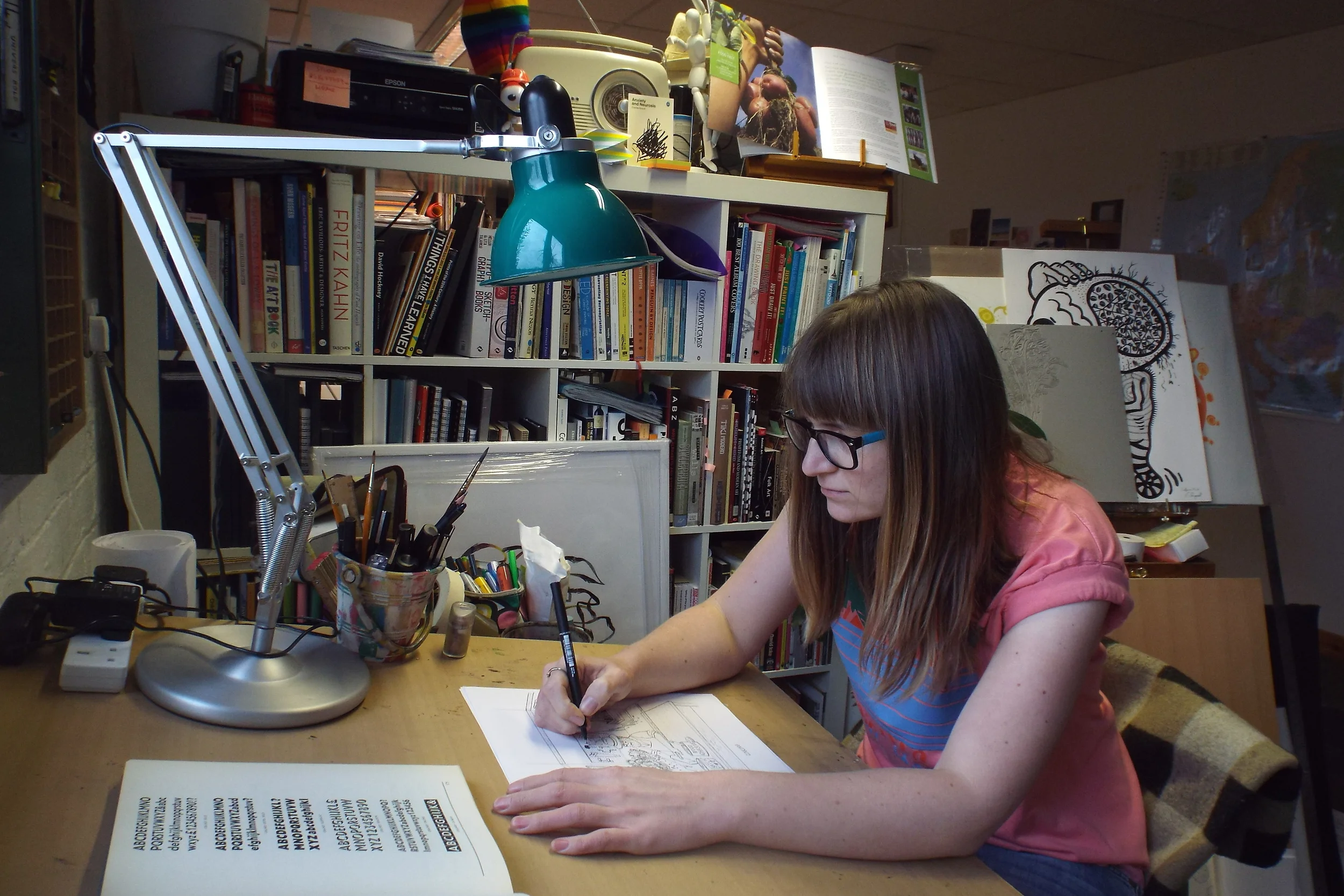
For the text, I've got an old, broken-spined book on typefaces. I'll try and find something in there first to adapt and draw by hand. It's my desert island design book.
For likenesses, it's good if I've met some of the people first, so no-one gets offended.
It's all drawn by hand, with colour added digitally. Firstly, I'll do a rough scribble in my notebook - unintelligible to anyone but me, then I draw out a pencil draft, sometimes twice to get it right.
I'm drawing at three times the scale of the printed label, so that I can get all that 'Where's Wally' style detail in there.
I use a lightbox to draw a second draft in ink. That gets sent to Ben to approve, then I'll work on the 'colouring-in' and piecing all the text elements together digitally.
And there we have it - the history of Emily and an insight into her design process. Some of it may even be true.